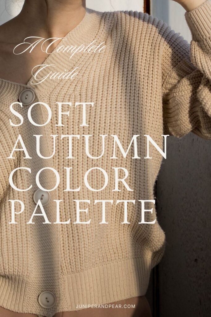
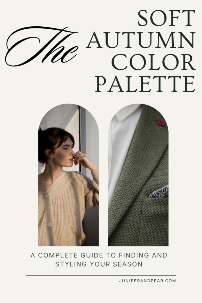
Soft Autumn Color Palette: A Complete Guide to Finding and Styling Your Season
The Soft Autumn color palette sits at the intersection of Autumn and Summer among the twelve seasonal color categories, borrowing characteristics from both. As a neutral-warm season, Soft Autumn leans slightly toward warmth but maintains a soft, muted quality that distinguishes it from its more saturated counterparts.
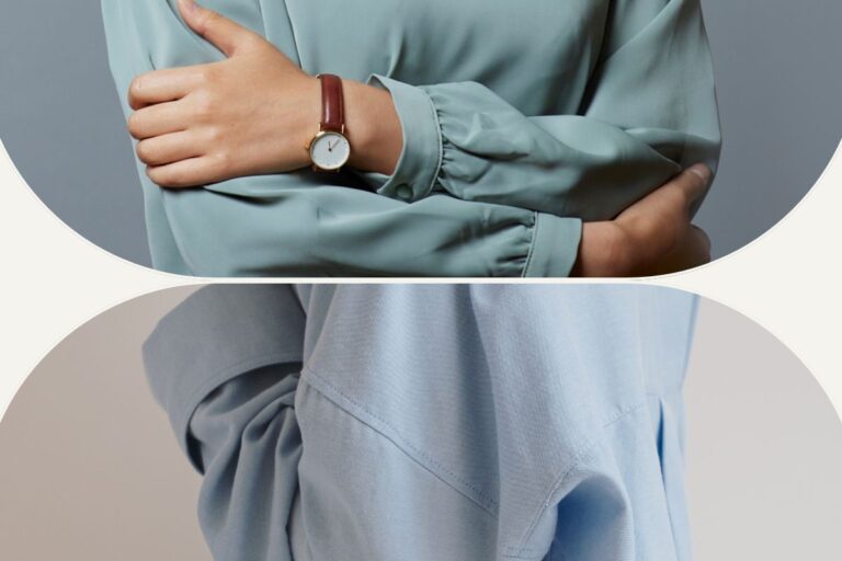
The defining characteristic of Soft Autumn is right there in the name: softness. This palette features colors that are muted and gentle, think of autumn seen through a soft filter, dried flowers, weathered stone, or a misty forest. These are understated, refined colors with a gentle warmth.
The Three Pillars of Soft Autumn
Softness/Mutedness (Primary): Soft Autumn looks best in colors that are muted, meaning they have gray mixed into them. These colors are never bright, vivid, or highly saturated.
Warmth (Secondary): There’s a gentle warmth to the Soft Autumn palette that distinguishes it from Soft Summer. The colors have subtle golden, peachy, or warm undertones rather than blue or pink. However, this warmth is gentle and never ventures into the rich, earthy intensity of True Autumn or Warm Autumn.
Medium Value (Tertiary): Soft Autumn colors are predominantly medium in value. They’re neither very light pastels nor very dark shades. This medium depth is part of what creates the palette’s grounded quality.
Identifying Soft Autumn Coloring
Determining your seasonal color type primarily involves understanding your skin undertone and how you respond to colors. Many people mistakenly believe that specific hair or eye colors define your season, but skin undertone is the most important feature.
The Importance of Skin Undertone
Skin undertone is the primary indicator of your color season. Soft Autumns can have any hair color or eye color.
Soft Autumn skin undertones are characterized by:
- Neutral-warm undertones with subtle golden, peachy, or warm beige qualities (this is the key defining feature)
- Skin across any depth, from fair to deep, though the neutral-warm undertone remains consistent
- Skin that looks even and refined in soft, warm colors
- A natural subtlety to the skin, not extremely warm or cool
- Cheeks that may flush with soft, peachy, or warm rose tones
- Skin that may tan to a soft, golden-neutral tone (for those who tan)
- Skin that looks washed out by very bright colors and sallow or gray in very cool colors
Soft Autumn skin has a gentle, neutral-warm quality. It’s not as distinctly warm as True Autumn or Warm Autumn, but it’s definitely warmer than cool.
Hair and Eye Color: Any Combination Works
Here’s an important truth: Soft Autumns can have virtually any natural hair or eye color. You might be a Soft Autumn with:
- Dark brown or black hair
- Light blonde, medium brown, auburn, or any hair color
- Brown, blue, green, hazel, amber, or any eye color
- Any combination of the above
What matters is not the specific color of your features, but how your overall coloring responds to the Soft Autumn palette. The colors that help you look authentically like you are more telling than your individual features.
Testing Your Season
The most reliable way to determine if you’re a Soft Autumn is through draping, holding different colored fabrics near your face and observing the effect:
You’re likely a Soft Autumn if:
- Soft, muted, warm colors (soft olive, dusty peach, muted teal, warm taupe) make your skin glow
- Bright, vivid colors overwhelm you and look harsh
- Cool colors make you look gray, tired, or washed out
- Very light, delicate pastels make you look washed out
- Your skin appears more even in muted, warm colors
- You need colors with some gray mixed in and gentle warmth to look your best
You’re likely NOT a Soft Autumn if:
- Bright, clear colors make you look more vibrant and alive
- Muted colors make you look dull, tired, or aged
- Cool colors enhance rather than drain you
- Soft Autumn’s muted warmth makes you look sallow
- You need high contrast or bold saturation to look your best
Overall Harmony
The key to Soft Autumn coloring is the overall effect. How does the Soft Autumn color palette interact with your natural coloring? Soft Autumns experience an evening effect when wearing their palette, regardless of their specific hair or eye color. The soft, muted, warm colors complement their skin’s undertone.
Soft Autumn vs. Similar Seasons
One of the trickiest aspects of color analysis is distinguishing between similar seasons. The Soft Autumn color palette shares characteristics with several other types, making it important to understand the subtle differences.
Soft Autumn vs. Soft Summer
This is one of the most common confusions. Both seasons are muted, but they differ in temperature:
Soft Autumn has warm undertones and looks best in muted, warm colors.
Soft Summer has cool undertones and looks best in muted, cool colors.
Compare how you look in dusty peach (warm) versus dusty rose (cool), or soft olive versus soft teal. Soft Autumns glow in the warm versions, while Soft Summers shine in the cool ones. This is the key distinction, temperature, not mutedness. Both seasons are equally muted.
Soft Autumn vs. True Autumn
Both seasons are warm, but they differ in their primary characteristic:
Soft Autumn’s primary trait is softness and mutedness. The colors are noticeably muted with gray mixed in.
True Autumn’s primary trait is warmth with more saturation. The colors are richer and more intense.
True Autumn’s colors like rust, pumpkin, and warm teal have more saturation and intensity than Soft Autumn can handle. Soft Autumn’s colors are like soft olive, dusty peach, and muted teal. If True Autumn’s colors seem slightly too intense, you’re likely Soft Autumn.
Soft Autumn vs. Light Spring
In some lighting, these seasons can appear similar, but they differ in mutedness:
Soft Autumn has muted, soft colors with gentle warmth.
Light Spring has clear, light colors with brighter warmth.
Light Spring’s colors like peach, coral, and mint are clearer and brighter than Soft Autumn’s dusty peach, soft olive, and muted teal. If Light Spring’s colors seem too bright and clear, you’re likely Soft Autumn.
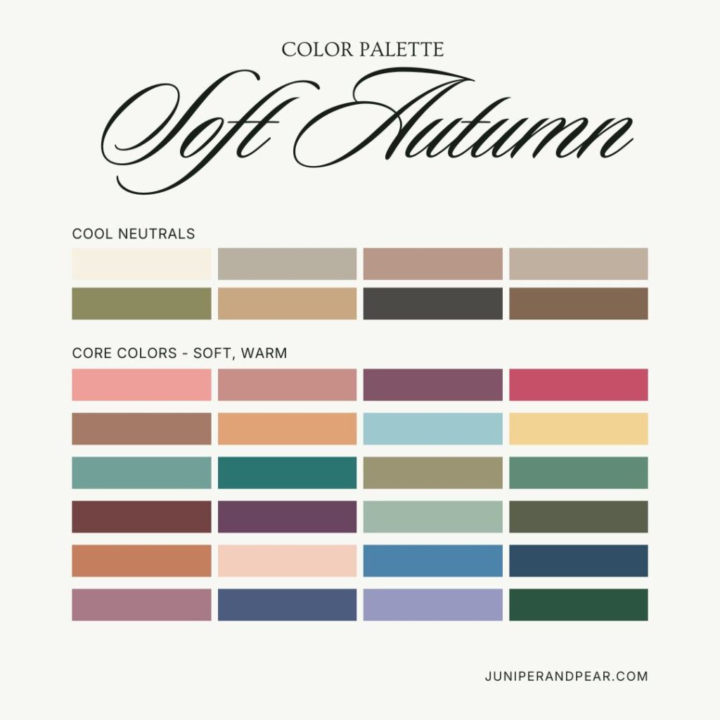
The Soft Autumn Color Palette
Understanding which specific colors work best for Soft Autumn will transform your wardrobe.
Best Neutrals
Soft Autumn neutrals provide a warm foundation:
- Cream (soft, not bright)
- Warm gray and gray-green
- Warm taupe and mushroom
- Soft olive
- Muted khaki
- Soft camel
- Warm charcoal
- Soft brown
- Stone and greige (warm-leaning)
Avoid stark white, black (too harsh), cool grays, and bright whites.
Optimal Colors by Category
Reds and Pinks:
- Dusty peach
- Muted coral
- Soft salmon
- Rose-brown
- Muted terracotta
- Soft warm pink (muted)
Oranges and Yellows:
- Dusty peach
- Muted apricot
- Soft pumpkin (muted)
- Soft golden yellow (muted)
- Warm beige-yellow
- Avoid bright oranges and yellows
Greens:
- Soft olive
- Sage green
- Muted jade
- Khaki green
- Soft pine
- Muted teal
- Gray-green
- Eucalyptus
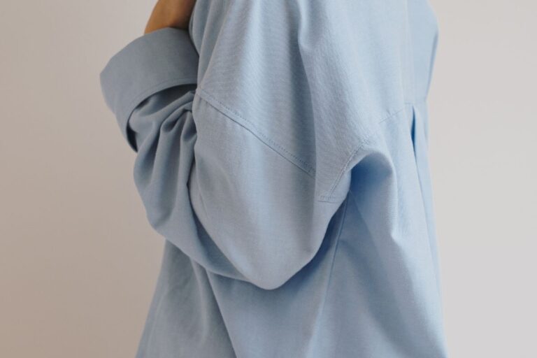
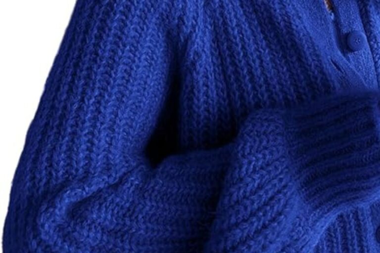
Blues:
- Muted teal
- Soft turquoise (warm-toned)
- Gray-blue (warm)
- Soft denim blue
- Avoid bright or cool blues
Purples:
- Soft plum (warm-toned)
- Muted aubergine
- Warm mauve (avoid if too cool)
Browns:
- Warm taupe
- Soft camel
- Mushroom
- Soft chocolate
- Warm brown
- Coffee with cream
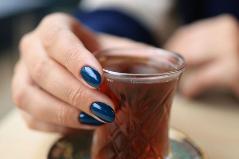
Colors to Avoid
Certain colors will drain Soft Autumns rather than light them up when worn too close to the face:
- Black (too harsh)
- Stark white (too bright)
- Bright, vivid colors like hot pink, bright orange, or electric blue
- Cool, icy colors like icy blue, cool fuchsia, or silver
- Colors with strong blue or pink undertones
- Very light, delicate pastels
- Very deep, dark colors without mutedness
- Clear, saturated colors
- Bright, intense warm colors like bright orange or vivid red
Styling Your Soft Autumn Wardrobe
Now that you understand your palette, let’s explore how to build a wardrobe that showcases your natural coloring.
Building a Capsule Wardrobe
Start with the Soft Autumn color palette neutrals as your foundation. A versatile base might include:
- Cream or warm taupe tops
- Soft olive or warm gray trousers or skirt
- Soft camel or warm charcoal blazer
- Mushroom or warm taupe cardigan
- Warm brown or soft olive shoes and bags
- Soft camel or warm charcoal coat
Add accent pieces in your best colors:
- Dusty peach blouse
- Muted teal sweater
- Soft olive dress
- Sage accessories
- Warm taupe scarf
- Soft plum top
This approach ensures everything coordinates while maintaining your best olor temperature and mutedness.
Understanding Color Placement
Colors closest to your face have the most impact on your appearance. As a Soft Autumn:
Near your face: Use your most flattering colors, dusty peach, soft olive, muted teal, sage, warm taupe, and cream.
Away from your face: You have more flexibility with bottoms and shoes. While staying within your palette is ideal, you can venture slightly outside it for pants, skirts, and footwear.
Accessories: Scarves, jewelry, and glasses frames in your palette colors can bring your natural warmth to life.
Patterns and Prints
Soft Autumns can wear patterns beautifully when they follow these guidelines:
- Choose patterns with muted, warm backgrounds
- Look for prints featuring Soft Autumn colors
- Avoid patterns with black, stark white, or bright colors
- Avoid patterns with cool, icy tones
- Medium-scale prints typically work well
- Natural, organic patterns often work beautifully
- Avoid bold, high-contrast prints
Makeup for Soft Autumn
Your makeup should boost your natural warmth and softness:
Foundation: Choose warm, neutral-warm, or soft golden foundations. Avoid pink or cool-toned formulas.
Blush: Dusty peach, soft coral, warm rose-brown, or soft terracotta create a natural flush.
Lipstick: Dusty peach, muted coral, soft salmon, warm nude, rose-brown, and muted terracotta are all flattering. Avoid bright pink, cool rose, or blue-based reds.
Eye Shadow: Soft olive, warm taupe, dusty peach, muted teal, soft plum, sage, and warm brown enhance Soft Autumn eyes. Skip bright colors, icy tones, and cool blues.
Eyeliner and Mascara: Soft brown, warm charcoal, or soft olive are more harmonious than harsh black.
Hair Color Considerations
If you color your hair, stay within Soft Autumn’s range:
- Soft golden blonde
- Warm ash blonde (with golden undertones)
- Soft caramel or honey brown
- Warm medium brown
- Soft auburn
- Avoid cool ash tones, platinum blonde, or colors that are too dark or too bright
No need to color your hair if you don’t want to, though. Like most people, your natural hair coloring already works with your palette. Yes, even as you shift into gorgeous grays!
Shopping Strategies for Soft Autumn
Finding the Soft Autumn color palette while shopping requires strategy, as not every store will carry your best shades consistently.
Seasonal Shopping
The Soft Autumn color palette appear most frequently during specific retail seasons:
- Fall collections feature many Soft Autumn colors, muted olives, warm taupes, dusty peaches
- Some summer collections include appropriate soft, warm colors
- Look for “upscale” or “timeless” collections
- Natural, organic, or earth-friendly brands often carry suitable colors
- Build your wardrobe strategically
- Shop sales for basics in your colors
Retailers and Brands
Certain retailers consistently carry colors that work for Soft Autumns:
- Brands with natural aesthetics
- Brands emphasizing earthy, organic styles
- Classic, timeless brands
- Brands inspired by nature
- Online shopping allows you to filter by color more easily
Making Do When Exact Colors Aren’t Available
Sometimes you’ll need to compromise:
- Prioritize getting the right colors near your face
- Bottoms can be slightly outside your ideal range if necessary
- Layering can help, wear a Soft Autumn scarf or cardigan over less ideal colors
- Accessories in your colors can tie an outfit together
- Muted, warm neutrals can anchor looks when exact colors aren’t available
Jewelry and Metals for Soft Autumn
The right metals can also help pull your look together.
Best Metals
Soft Autumns typically look best in:
- Yellow gold (soft, matte, or brushed finish often better than high shine)
- Rose gold (warm-toned)
- Brass (soft, antiqued)
- Bronze
- Copper (muted)
- Mixed metals in warm tones
- Antiqued or brushed metals rather than high-polish
Avoid
- Bright, shiny silver (too cool and bright)
- Platinum (too cool)
- White gold (too cool)
Gemstones and Pearls
Choose muted, warm gemstones:
- Pearls: Golden, cream, champagne, or soft peachy rather than white
- Stones: Amber, citrine (soft), topaz (warm), jade (soft olive), turquoise (muted), carnelian, peridot (muted), tiger’s eye, malachite, aventurine, moss agate, smoky quartz
- Choose stones with soft, muted color rather than bright, vivid versions
- Stones with an organic, earthy quality
Beyond Clothing: Lifestyle Applications
Your color palette extends beyond your wardrobe:
Home Decor
Create a comfortable living space with colors from the Soft Autumn color palette:
- Wall colors in cream, warm gray, or soft olive
- Accent walls in dusty peach, muted teal, or warm taupe
- Wood tones in warm, natural finishes, walnut, oak, teak
- Textiles in your palette colors, soft olives, warm taupes, dusty peaches
- Natural materials, linen, cotton, wood, stone
- Plants and natural elements
- Art featuring soft, muted, warm colors
- Furniture in natural, warm tones
Digital Presence
Apply your palette to digital spaces:
- Website color schemes using Soft Autumn colors
- Social media graphics in your palette
- Email signatures with appropriate colors
- Zoom backgrounds in flattering shades
- Presentation templates with soft accent colors
Living as a Soft Autumn
Understanding your color season isn’t about following rules, it’s really only about feeling confident and authentic to you.
Confidence in Your Palette
Once you’ve identified as a Soft Autumn:
- Trust the palette even when trends suggest otherwise
- Remember that wearing your colors is always more flattering than following fashion
- Build your wardrobe gradually with intentional pieces
- Embrace muted, warm colors
- Recognize that “muted” doesn’t mean “boring”, it means soft and timeless
Flexibility and Personal Style
Color analysis is a tool, not a rigid system:
- Your personal style matters, incorporate your palette into your aesthetic
- Occasional departures from your palette is totally fine!
- The goal is enhancement, not restriction
- Use the 80/20 rule: 80% of your wardrobe in your palette, 20% flexibility
- Soft Autumn colors work for any style from minimalist to bohemian to classic
The Transformation
Many Soft Autumns report that discovering their season transforms their relationship with color:
- Shopping becomes easier and more intentional
- You stop wasting money on clothes, makeup, and accessories you don’t like wearing
- Getting dressed feels effortless
- Confidence, baby!
- You stop trying to wear bright or cool colors that don’t suit you
- You appreciate the sophistication and warmth of your palette
Special Considerations for Soft Autumn
Avoiding Brightness and Coolness
Soft Autumn is the season that needs to avoid both bright colors and cool colors:
- Bright colors make Soft Autumns look harsh and overwhelmed
- Cool colors make Soft Autumns look gray and washed out
- The muted warmth of your palette is what creates harmony
- Trust that soft, warm colors are your superpower
wearing black
Soft Autumn should avoid black. It’s too harsh and stark for the muted, warm Soft Autumn coloring. Instead:
- Use warm charcoal, soft brown, or soft olive for a dark neutral
- If you must wear black (formal events, work requirements), keep it away from your face
- Add Soft Autumn colors near your face with scarves, jewelry, or makeup
- Consider a warm charcoal or soft brown suit instead of black
Embracing Mutedness and Warmth
Some Soft Autumns worry that their palette is “too muted” or “too boring.” Remember:
- Muted, warm colors on you look efined, not dull
- Your natural coloring is enhanced by soft, warm colors
- Soft Autumn colors are timeless
- Trying to add “pop” with bright colors works against your natural harmony
- Your muted warmth is calming and expensive-looking
Professional Settings
Soft Autumn colors work beautifully in professional environments:
- Cream or warm taupe shirts with warm charcoal or soft camel suits
- Soft olive or warm gray tailored pieces
- Dusty peach, muted teal, or soft plum as accent colors
- Avoid the corporate uniform of black and stark white, it doesn’t serve you
- Soft Autumn is naturally professional-looking and trustworthy
Monochromatic Styling
Soft Autumns often look stunning in monochromatic or tonal looks:
- All soft olive
- All warm taupe
- All muted teal
- All warm brown tones
- Gradations of muted, warm colors
Color Combinations
Soft Autumns can create these color combinations:
- Soft olive with dusty peach
- Warm taupe with muted teal
- Sage with soft camel
- Warm gray with soft plum
- Cream with soft olive
- All colors should be similarly muted and warm for best results
The Sophistication of Soft Autumn
Soft Autumn is a season that celebrates muted warmth, and understated elegance. This palette is for those who look best in these soft warm colors that create a timeless effect.
The Psychology of Muted Warm Colors
Wearing your Soft Autumn color palette does more than make you look good:
- Projects warmth and approachability
- Creates a calm, grounded presence
- Makes you trustworthy and reliable
- Has a timeless, organic quality
- Suggests quiet confidence
Common Misconceptions
“Muted colors are boring”: For Soft Autumns, muted colors are naturally elegant. Bright colors make you look discordant and overwhelmed.
“I need bright colors to stand out”: Soft Autumns stand out through refinement and natural warmth, not through harsh contrast.
“Warm colors make everyone look sallow”: Cool colors make Soft Autumns look gray and washed out. Warm colors make warm-toned people look even and radiant.
“I’m too young for such an ‘earthy’ palette”: Color harmony has nothing to do with age. Soft Autumns of all ages look best in their muted, warm palette. Bright or cool colors age and overwhelm Soft Autumns regardless of actual age.
“Muted autumn colors are too casual”: The Soft Autumn color palette can be dressed up or down. They’re work beautifully in professional and formal settings.
Conclusion
Soft Autumn is a beautiful season characterized by muted, warm, refined colors that echoes autumn mist, dried flowers, and weathered stone. If you have neutral-warm skin undertones and look lovely in muted, warm colors, Soft Autumn may be your perfect palette, regardless of your specific hair or eye color.
By understanding your season’s characteristics, learning which colors play up your natural beauty, and crafting a wardrobe that reflects your palette, you’ll discover how transformative personal color analysis can be. The goal isn’t to limit you, but rather to help you look your best, save time, and reduce buying frustration.
Welcome to the world of Soft Autumn!