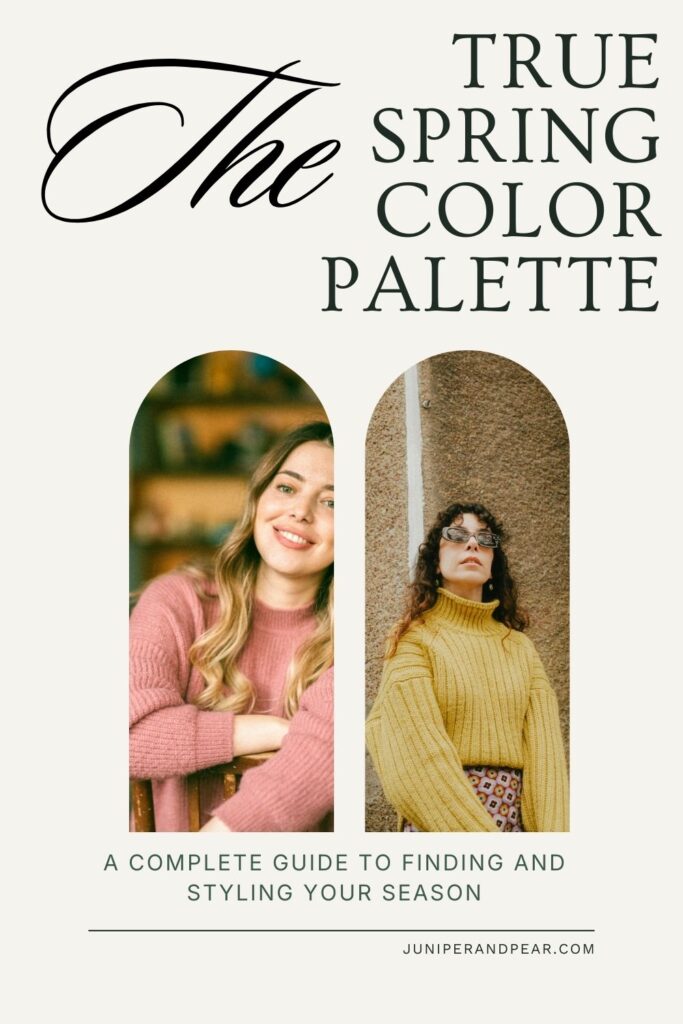
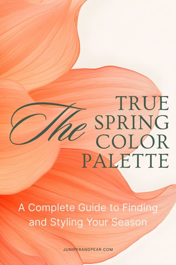
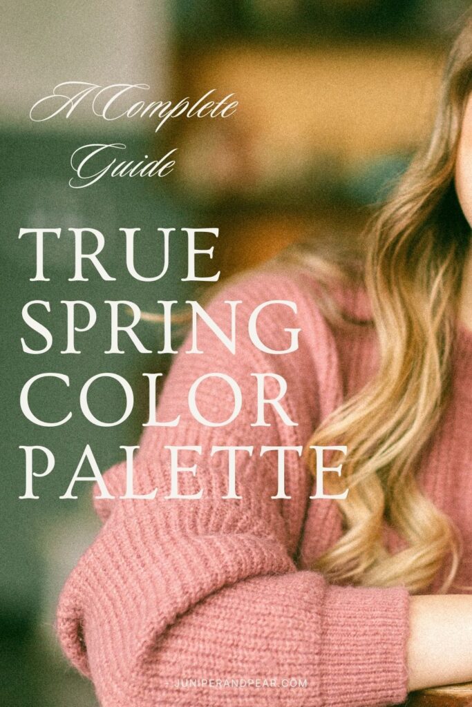
True Spring Color Palette: A Complete Guide to Finding and Styling Your Season
True Spring, also called Bright Spring or Clear Spring, represents the heart of the spring season among the twelve seasonal color categories. It’s a warm palette characterized by colors that are bright and clear. Think of a spring garden in full bloom under brilliant sunshine.
Unlike the other spring seasons, the True Spring color palette is balanced in its characteristics. It’s purely warm without leaning toward lightness like with Light Spring. The colors are clear and vivid.
The Three Pillars of True Spring
Warmth (Primary): True Spring is definitively warm. The colors have yellow, golden, or peachy undertones rather than blue or pink. This warmth is clear and bright rather than muted or earthy.
Clarity (Secondary): True Spring colors are clear, bright, and saturated. There’s no muddiness or dustiness to the palette. These are clean colors that seem to glow with inner light. The clarity distinguishes True Spring from softer, more muted palettes.
Medium Value (Tertiary): True Spring colors range from light to medium-dark but aren’t exclusively light or dark. The palette includes both pastels and deeper shades, all maintaining their characteristic warmth and clarity.
Identifying True Spring Coloring
Determining your seasonal color type primarily involves understanding your skin undertone and how you respond to colors. Many people mistakenly believe that specific hair or eye colors define your season, but skin undertone is the most important feature.
The Importance of Skin Undertone
Skin undertone is the primary indicator of your color season. True Springs can have any hair color or eye color, but what defines them is their skin’s undertone and how they respond to colors.
True Spring skin undertones are characterized by:
- Clear, warm undertones with golden or peachy qualities (this is the key defining feature)
- Skin across any depth, from fair to deep, though the warm undertone remains consistent
- Skin that looks even in warm, clear colors
- A natural golden warmth that’s readily apparent
- Cheeks that flush with warm peachy or coral tones
- The ability to tan to a warm golden color (for those who tan)
- A complexion that appears alive in bright, warm colors
- Skin that may have warm-toned freckles or sun spots
True Spring skin rarely appears cool-toned with blue or pink undertones. It also doesn’t have the muted, soft quality of the Soft seasons or the neutral-cool quality of Summer skin types.
Hair and Eye Color: Any Combination Works
Here’s an important truth: True Springs can have virtually any natural hair or eye color. You might be a True Spring with:
- Dark brown or black hair
- Light blonde, medium brown, auburn, or red hair
- Brown, blue, green, hazel, amber, or gray eyes
- Any combination of the above
What matters is not the specific color of your features, but how your overall coloring responds to the True Spring color palette. The colors that help you look authentically like you are more telling than your individual features.
Testing Your Season
The most reliable way to determine if you’re a True Spring is through draping. This means holding different colored fabrics near your face and observing the effect.
You’re likely a True Spring if:
- Warm, clear, bright colors (coral, warm turquoise, bright golden yellow, warm red) make your skin glow
- Cool, icy colors make you look washed out, tired, or sallow
- Muted, dusty colors make you appear dull
- Very soft pastels aren’t quite vibrant enough for you
- Your skin appears even in True Spring colors
- You can handle both light and deeper colors as long as they’re warm and clear
You’re likely NOT a True Spring if:
- Cool, icy colors make you look more awake
- Muted, soft colors are more flattering than bright ones
- True Spring’s colors make you look overwhelmed or garish
- You need very light, delicate colors or very deep, rich colors exclusively
- Warm colors make you look yellow, sallow, or tired
Overall Harmony
The key to True Spring coloring is the overall effect. How do True Spring colors interact with your natural coloring? True Springs experience a vibrant effect when wearing their palette, regardless of their specific hair or eye color. The warm, clear colors complement their skin’s undertone, creating a cohesive and even appearance.
True Spring vs. Similar Seasons
One of the trickiest aspects of color analysis is distinguishing between similar seasons. True Spring shares characteristics with several other types, making it important to understand the subtle differences.
True Spring vs. Light Spring
Both seasons are warm, but they differ in their primary characteristic:
True Spring’s primary trait is clarity and brightness. The colors are vivid, clear, and can range from light to medium depth.
Light Spring’s primary trait is lightness. The colors are delicate, soft, and predominantly pastel.
True Springs can wear Light Spring’s pastels but also shine in more saturated colors like bright coral, warm turquoise, and vivid golden yellow. However, these colors would overwhelm Light Spring. If you find that soft pastels aren’t quite enough and you need more intensity, you’re likely True Spring.
True Spring vs. True Winter
This might seem like an unlikely confusion since one is warm and one is cool, but both seasons share high clarity:
True Spring colors are warm, clear, and bright with golden undertones.
True Winter colors are cool, clear, and bright with blue undertones.
The key difference is temperature. True Springs look sallow and tired in True Winter’s icy brights like royal blue or fuchsia, while True Winters look yellowish in True Spring’s warm brights. Compare how you look in warm coral versus cool hot pink, or warm turquoise versus cool royal blue.
True Spring vs. Bright Spring
In some color analysis systems, these are the same season. In 12-season systems that distinguish them:
True Spring is purely warm with clear, bright colors.
Bright Spring is neutral-warm, leaning slightly toward coolness while maintaining brightness.
Bright Spring can borrow some colors from True Winter, while the True Spring color palette stays firmly in warm territory. This is a subtle distinction that many people don’t need to worry about. But if you find yourself favoring one or the other, go with it!
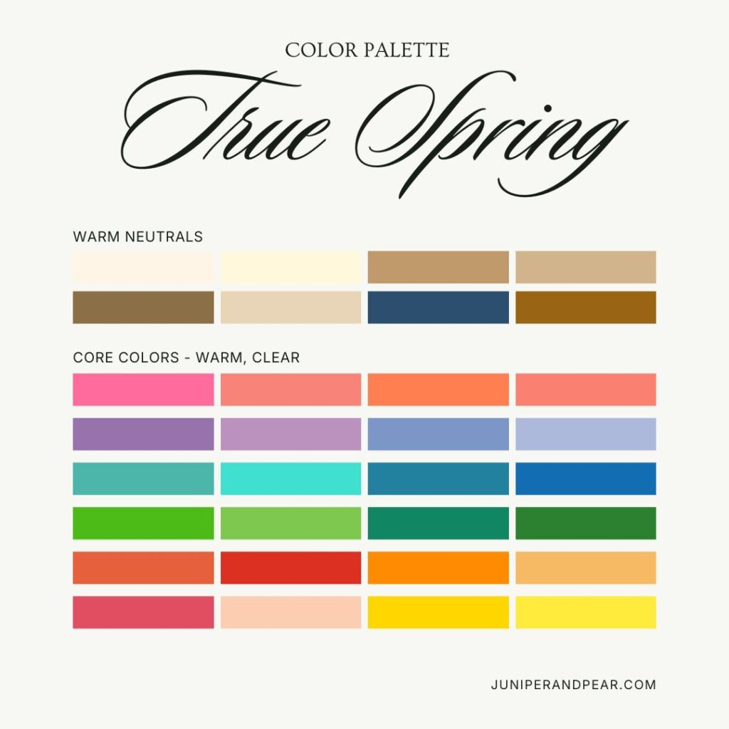
The True Spring Color Palette
Understanding which specific colors work best for True Spring will transform your wardrobe and confidence.
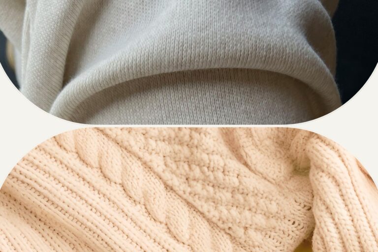
Best Neutrals
True Spring neutrals provide a warm, clear foundation:
- Warm ivory and cream
- Camel and warm tan
- Warm taupe
- Light warm brown
- Medium warm brown
- Warm navy
- Clear chocolate brown
- Warm beige
Optimal Colors by Category
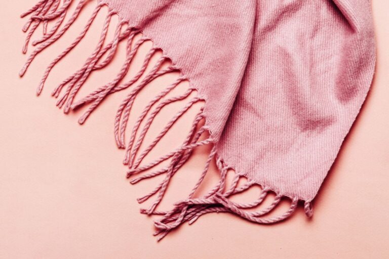
Reds and Pinks:
- Warm, clear red (poppy red, tomato red)
- Bright coral and warm coral pink
- Warm watermelon
- Bright warm rose
- Orange-red
- Peach and apricot
Oranges and Yellows:
- Bright warm orange
- Mango and tangerine
- Pumpkin
- Bright golden yellow
- Daffodil yellow
- Marigold
- Warm butter yellow
Greens:
- Warm kelly green
- Bright lime and apple green
- Warm emerald
- Grass green
- Spring green
- Warm jade
- Bright warm teal
Blues:
- Warm turquoise and aqua
- Bright warm teal
- Periwinkle with warmth
- Clear sky blue
- Warm bright blue
- Warm medium navy
Purples:
- Bright warm violet
- Clear purple with warmth
- Periwinkle
- Bright warm lavender
Browns:
- Camel and golden brown
- Warm tan
- Milk chocolate
- Cinnamon
- Tawny
- Warm coffee
Colors to Avoid
Certain colors will drain Light Springs rather than light them up when worn too close to the face:
- Black (too harsh and stark)
- Muted, dusty colors like dusty rose, sage, or slate
- Cool, icy colors like icy blue, cool fuchsia, or silver
- Deep, cool colors like burgundy, navy with blue undertones, or forest green
- Colors with significant gray added that appear muted
- Very soft, washed-out pastels that lack vibrancy
- Earthy, muted colors like rust, olive, or moss
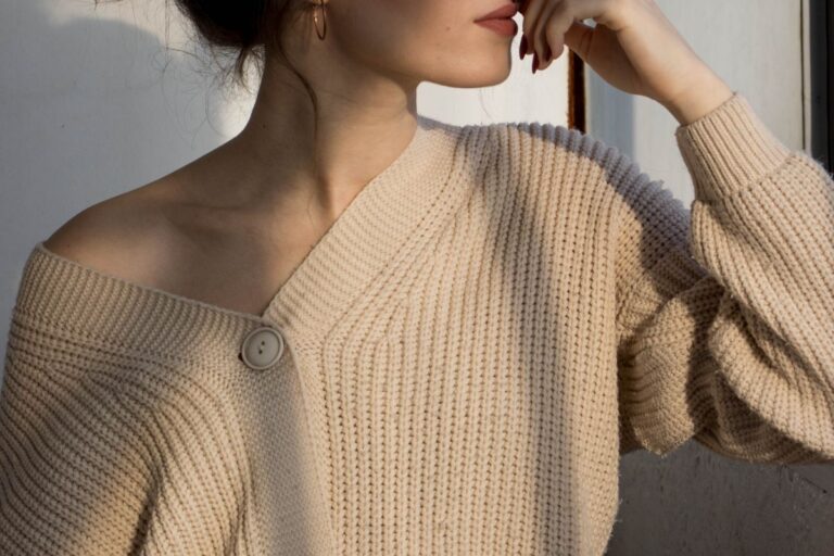
Styling Your True Spring Wardrobe
Now that you understand your palette, let’s explore how to build a wardrobe that showcases your natural beauty:
Building a Capsule Wardrobe
Start with True Spring color palette neutrals as your foundation. A versatile base might include:
- Cream or warm ivory tops
- Camel trousers or skirt
- Warm navy blazer
- Warm tan cardigan
- Warm brown shoes and bags
- Warm taupe or camel coat
Add accent pieces in your best brights:
- Bright coral blouse
- Warm turquoise sweater
- Poppy red dress
- Golden yellow accessories
- Bright teal scarf
- Warm kelly green top
Understanding Color Placement
Colors closest to your face have the most impact on your appearance. As a True Spring:
Near your face: Use your most flattering colors, like bright corals, warm turquoise, golden yellow, poppy red, and cream. These will lift your complexion and make your entire appearance come alive.
Away from your face: You have more flexibility with bottoms and shoes. While staying within your palette is ideal, you can venture slightly outside it for pants, skirts, and footwear.
Accessories: Scarves, jewelry, and glasses frames in your palette colors
Patterns and Prints
True Springs can wear bold patterns beautifully when they follow these guidelines:
- Choose patterns with warm, clear backgrounds (cream, golden yellow, warm turquoise)
- Look for prints featuring True Spring colors like coral, turquoise, golden yellow, and warm red
- Avoid patterns with black, cool gray, or muted dusty colors
- Medium to large-scale prints can work well with True Spring’s bold nature
- Tropical prints, geometric patterns, and bold florals
- Look for prints with clear, saturated colors rather than soft, watercolor effects
Makeup for True Spring
Your makeup should enhance your natural warmth and clarity:
- Foundation: Choose warm, golden, or peachy-toned foundations. Avoid pink or neutral-cool formulas.
- Blush: Bright coral, warm peach, warm apricot, or clear warm pink
- Lipstick: Coral, bright warm pink, poppy red, orange-red, peach, and warm rose are all flattering. Avoid burgundy, mauve, or cool blue-pinks.
- Eye Shadow: Warm browns, coral, peach, turquoise, golden yellow, warm purple, and bright green enhance True Spring coloring. Skip cool silvers, muted taupes, and soft dusty colors.
- Eyeliner and Mascara: Warm brown, teal, or warm navy are best. Black can work for evening but warm brown is often better for day.
Hair Color Considerations
If you color your hair, stay within True Spring’s range of warm, clear tones:
- Golden blonde with warm highlights
- Warm caramel or honey brown
- Auburn or warm copper red
- Rich warm brown
- Avoid ash tones, cool browns, platinum blonde, or blue-black
No need to color your hair if you don’t want to, though. Like most people, your natural hair coloring already works with your palette. Yes, even as you shift into gorgeous grays!
Shopping Strategies for True Spring
Finding True Spring colors while shopping requires strategy, as not every store will consistently carry your optimal shades.
Seasonal Shopping
The True Spring color palette often appear during specific retail seasons:
- Spring collections feature the best True Spring colors, look for bright corals, turquoise, golden yellows
- Summer collections often include warm, clear brights
- Resort collections typically feature tropical brights and warm colors
- Build your wardrobe during these peak seasons
- Shop off-season sales strategically for basics
Stores and Brands
Certain stores consistently carry colors that work for True Springs:
- Brands with energetic aesthetics often feature suitable colors
- Athletic and activewear brands often use bright, clear colors
- Brands inspired by tropical or warm climates
- Online shopping allows you to filter by color more easily
- Building relationships with personal shoppers who understand your palette
Making Do When Exact Colors Aren’t Available
Sometimes you’ll need to compromise:
- Prioritize getting the right colors near your face
- Bottoms can be slightly outside your ideal range if necessary
- Layering can help, wear a True Spring scarf or cardigan over less ideal colors
- Accessories in your colors can tie an outfit together
- A bright True Spring lipstick can transform a neutral outfit
Jewelry and Metals for True Spring
The right metals can also help pull your look together.
Best Metals
True Springs typically look best in:
- Yellow gold (bright, warm gold)
- Rose gold
- Warm-toned mixed metals
- Bright, polished metals rather than oxidized or antiqued finishes
- Brass with warm tones
Secondary Choices
You can also wear:
- Bright silver (though warm metals are usually better)
- Copper
- Bronze with golden tones
Gemstones and Pearls
Choose warm, clear gemstones:
- Pearls: Golden, cream, or peachy rather than pure white or gray
- Stones: Coral, citrine, warm aquamarine, warm sapphire, topaz, peridot, warm amethyst, turquoise, amber, carnelian, warm emerald
- Choose stones with clear, saturated color
Beyond Clothing: Lifestyle Applications
Your color palette extends beyond your wardrobe:
Home Decor
Create a harmonious living space with True Spring colors:
- Wall colors in warm cream, soft golden yellow, or warm coral
- Accent walls in turquoise, warm teal, or bright coral
- Natural wood tones in warm, golden finishes
- Textiles in your palette colors, like throw pillows, rugs, curtains
- Fresh flowers in spring colors, such as tulips, daffodils, coral roses
- Art featuring warm colors
Digital Presence
Apply your palette to digital spaces:
- Website color schemes using True Spring colors
- Social media graphics in your palette
- Email signatures with appropriate colors
- Zoom backgrounds in flattering shades
- Presentation templates with warm, clear colors
Living as a True Spring
Understanding your color season isn’t about following rules, it’s really only about feeling confident and authentic to you.
Confidence in Your Palette
Once you’ve identified as a True Spring:
- Trust the True Spring palette even when trends suggest otherwise
- Remember that wearing your colors is always more flattering than following fashion
- Build your wardrobe gradually with intentional pieces
- Let go of colors that don’t serve you, even if you love them in theory
- Embrace the brightness, True Springs can handle bold, saturated colors
Flexibility and Personal Style
Color analysis is a tool, not a rigid system:
- Your personal style matters, incorporate your palette into your aesthetic
- Occasional departures from your palette won’t ruin your appearance
- The goal is enhancement, not restriction
- Use the 80/20 rule: 80% of your wardrobe in your palette, 20% flexibility
- Some True Springs prefer more vibrant looks while others prefer a subtler approach
The Transformation
Many True Springs report that discovering their season transforms their relationship with color:
- Shopping becomes easier and more enjoyable
- You stop wasting money on clothes, makeup, and accessories you don’t like wearing
- Getting dressed feels effortless
- Confidence, baby!
- You feel more aligned with your natural energy
Special Considerations for True Spring
Wearing Black
True Spring is one of the seasons that struggles most with black. It’s simply too cool and harsh for the warm, clear True Spring coloring. Instead:
- Use warm navy or dark chocolate brown for a dark neutral
- If you must wear black (formal events, work requirements), try to keep it away from your face
- Add True Spring colors near your face with scarves, jewelry, or makeup
- Consider warm charcoal gray as an alternative
Balancing Brightness
Some True Springs worry that their palette is “too bright” or “too bold.” Remember:
- You don’t have to wear only the brightest colors, your neutrals are equally important
- A camel blazer with a bright coral blouse balances bold and neutral
- Monochromatic looks in True Spring neutrals can be so beautifully sophisticated
- Your natural coloring can handle the brightness, trust the palette!
- Bright accessories on neutral outfits are an easy way to incorporate your colors
Professional Settings
True Spring colors are lovely in professional environments:
- Warm navy suits with cream blouses
- Camel or warm brown tailored pieces
- Warm turquoise or coral as accent colors
- Avoid the corporate uniform of black, white, and gray if it doesn’t serve you
- Your warm, clear colors project confidence and approachability
Conclusion
True Spring is a vibrant season characterized by warm, clear, bright colors that echo the vitality of spring in full bloom. If you have warm, golden skin undertones and look even in bright, clear, warm colors, True Spring may be your perfect palette, regardless of your specific hair or eye color.
By understanding your season’s characteristics, learning which colors play up your natural beauty, and crafting a wardrobe that reflects your palette, you’ll discover how transformative personal color analysis can be. The goal isn’t to limit you, but rather to help you look your best, save time, and reduce buying frustration.
Welcome to the world of True Spring!